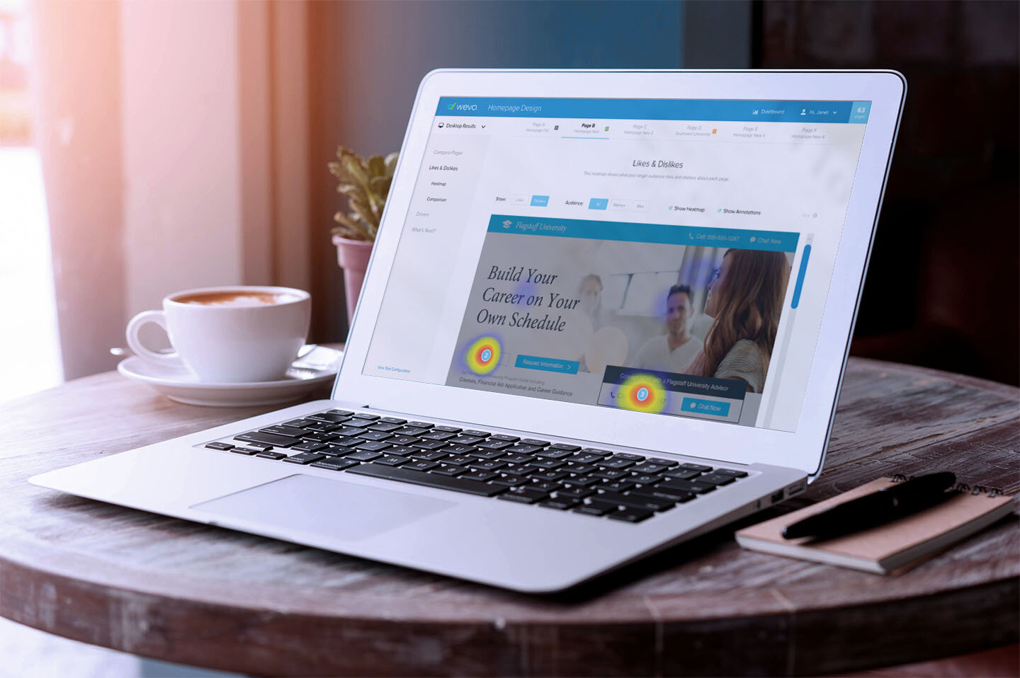
WEVO Conversions
STRATEGY | DESIGN
WEVO is an online service for digital marketers that increases website conversion by leveraging machine learning and crowdsourcing in days. WEVO decreases the average conversion optimization timeline and reduces the development resources needed to produce a higher converting landing page through rapid A/B testing.

Process
I joined the WEVO team as they were transitioning from being a consulting agency to having an idea of developing a SaaS product for their clients. I was briefed on their current workflow and of their vision of creating a rapid A/B testing platform. After understanding how WEVO works with their current clients and WEVO’s goals for the product, I began bringing the SaaS product to life.
The WEVO Platform
Diagnose
Pinpoint why visitors aren't converting
Compare
See which page will do best before launching
Improve
Get actionable recommendations to increase conversion
User Flow
First, a user flow was defined to show how a client would sign up, start a test, receive results and share those results.
Wireframes
After defining the user flow, I started working on wireframes for each section of the flow.
Dashboard Exploration
I explored multiple ways of designing the dashboard. The first row shows a dashboard design using a left navigation where the user can filter results by device type, and test status. The middle dashboard designs replace the left navigation with a top tabbed navigation for filtering test status. The user can also sort the tests by name, date or device type. The bottom examples use an accordion menu to filter the tests by status. Each section can also be sorted by test name, date or device type.

Visual Design
After creating wireframes for each screen, I turned the wireframes into designs using WEVO’s brand colors and guidelines. Next, I created annotations for the designs and handed the files and specifications to the development team. I also created a clickable prototype for the product.
Prototype
See the final design in action. View the prototypes.


